
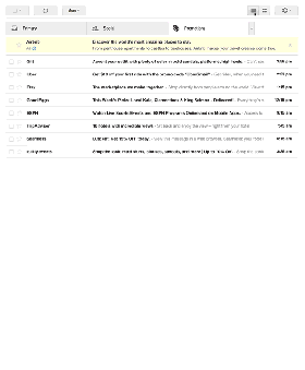
 Gmail have just started a limited trial of a new grid visual inbox for the Promotions tab.
Officially acknowledging that many promotional emails are image heavy Google is testing whether a grid of images provides a better way for users to select emails to read from their promotions tab contents.
This is just a trial and whether it makes it main stream depends on its success.
But what counts as success?
When the promotions tab was introduced, Ads in the tab were also added. A large part of trial success for Google is likely going to be based on how much Ad revenues increase from this new layout. Any revenue decrease and we can expect Gmail to ditch the grid and try a different approach.
As before Google Ads get placed top in the grid and notice how the difference between Ads and brand promotional emails becomes even more subtle.

The impact this layout has on promotional emails is huge.
No longer is the text subject line the most important bit of your email. A/B subject line split testing will be replaced with inbox grid image split testing. And that gives a huge amount more possibilities for creativity to get standout.
By default Gmail will select the image to show in the grid from an email. However, the sender may determine the image used by using extra mark-up in their HTML.
Google get more offer insight
Should the sender specify the image to display then they also must provide information about the promotional offer. This provides Google with a neat way of collecting offer data and analysing the offers being sent to particular users.
So Google gets more insight as to which offers to target at which users and thus increase their Ad revenue further.
Integrating with Google+
The sender icon image may also be specified by the sender, but it has to come from a verified Google+ page. Further evidence of Google’s connected view of Email and Social Network – unlike that of Facebook which has recently removed their substandard email feature. It also paves the way for Gmail to add +1’s into the inbox.
Will it take-off?
The ability to grab attention with an image rather than just a subject line is too big a benefit for brands to miss out on. So whilst the HTML mark-up is Gmail specific, should the trial make it to full rollout I expect brands to start adopting the mark-up to control the image that is shown.
It’s certainly great to see Google investing and innovating in Gmail, albeit for sure in part with their own revenue agenda.
However, one thing is for certain. Google clearly understands the value of email and is looking to make email even better at the same time as integrating with their social vision.
This is not the last change to Gmail and we can expect many more moves in the next year. It’s all rather exciting to see email maintaining its place at the core of the internet.
To find out how HTML coders can control the image that is displayed in Gmail’s inbox offer specification.
If you want to see how it looks in your Gmail account sign up for the trial
Post update: Latest results from testing of the Grid and how it works.