
 An unsubscribe link is the law however unsubscribe best practices are about more than staying legal.
Getting unsubscribe right means a cleaner list and stronger deliverability.
I ran usability tests on six brand emails. In the worst-case users needed 2 minutes to unsubscribe and 12% couldn’t find the unsubscribe link.
The test results highlight the best practices and illustrate what confuses customers. A lesson as important to unsubscribe as to buy now links.
Unsubscribe Paranoia
First, don’t panic. It’s not the end of the world when someone wants to unsubscribe.
We’d all prefer nobody ever wanted to unsubscribe. But it’s part of life, people fall in love and out again.
Examples further below show how to provide alternatives to unsubscribe. When that fails the best chance of a future relationship is by gracefully letting go. Leave them smiling.
Making the unsubscribe difficult won’t create a great relationship.
Consumers Struggle with Unsubscribe
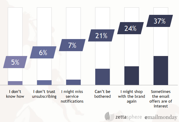
The Email Addiction report asked consumers why they don’t unsubscribe from the emails that they opted-in to and now ignore. 5% said because they didn’t know how, 6% because they don’t trust unsubscribing and 21% can’t be bothered. Brands have made it too hard.
That’s up to 32% of your list that want to unsubscribe, but don’t. This weakens your sender reputation for two reasons:
- Consumers mark the email as spam. The Litmus report ‘adapting to consumers new definition of spam’ report found 50% of consumers marked an email as spam because of confusing or painful unsubscribe.
- Customers that ignore rather than unsubscribe contribute to your inactive subscribers.
A common tactic to improve sender reputation is to remove inactives. But there is a problem.
In the above chart 61% of inactive people are lurking until the time is right. They happily ignore emails rather than unsubscribe. Because either they feel they may shop again or are waiting for the right offer.
Behaviourally they are inactive. They look the same as the people who really want out. That means removing inactives to improve reputation risks reducing revenue.
Removing inactives is a blunt instrument, best avoided.
By making it easy for subscribers to remove themselves, you’ll keep a cleaner list without a revenue risky list purge.
Unsubscribe Usability Tests Results
What’s so hard about unsubscribe?
In most cases, scroll to the bottom and find the unsubscribe link. You’d think, right?
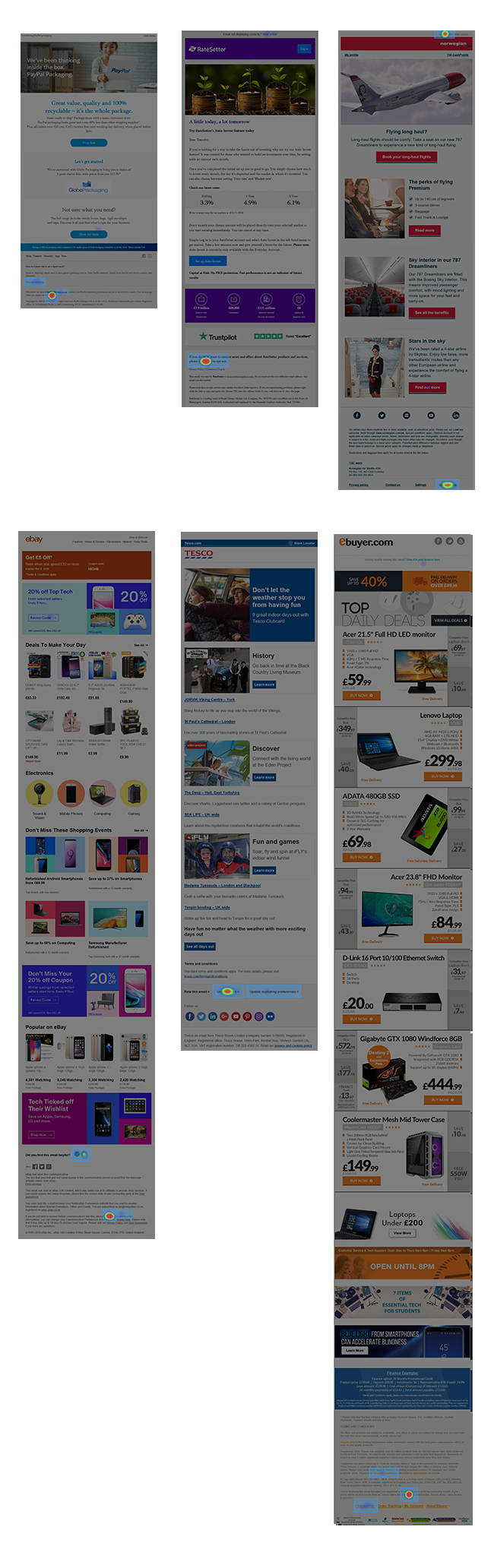
It turns out finding the unsubscribe link is not always easy, as shown by usability tests on emails from Tesco, eBay, PayPal, RateSetter, Norwegian Airlines and eBuyer.
The brands were picked because they shows different designs for unsubscribe. All designs that are commonly used by many brands.
The tests were performed using the excellent UsabilityHub research platform. It’s a seriously good tool to improve user experience.
Each brand email was shown to 50 test participants. No test participant saw more than one brand email.
Participants were asked “If you received this email, where would you click to stop getting more emails from this brand?”
Usability was measured based on two factors:
- Accuracy – did they click the right place.
- Speed – length of time it took for participants to click
The results:
| Accuracy (%) | Speed (s) | |
| Norwegian Airline | 98 | 10 |
| Tesco | 98 | 13 |
| RateSetter | 91 | 16 |
| PayPal | 88 | 20 |
| eBay | 82 | 21 |
| eBuyer | 88 | 33 |
Norwegian Airline was best with 98% of test participants clicking the right place to unsubscribe, taking an average of 10 seconds.
Contrast with eBay in which 18% of participants clicked the wrong place to unsubscribe!
Here are the heat maps for all six emails. The blue boxes show where participants tried clicking and the color indicates how many participants clicked the same area.
Why the big differences?
There are clear design reasons for the differences, pointing the way to best practices for unsubscribe links.
In fact, lessons not only for improving unsubscribe performance but performance of any call to action.
Let’s have a look at each brand in turn.
Norwegian Airline
Overall the best performer for usability; 98% accuracy and the unsubscribe link could be found in 10 seconds.
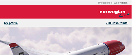
Notably the email includes an unsubscribe link at the bottom and the top. It’s the only email in this test with a top unsubscribe link.
And the bottom of the email:
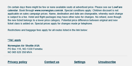
The unsubscribe link at the bottom is easily spotted:
- It uses a larger font than most of the footer copy
- Whitespace around the link makes it standout
- It’s at the very bottom rather than in the middle of dense footer copy
Because there is an unsubscribe link at the top you might think the bottom link is not needed. The results show otherwise. Only 42% of the participants clicked the top unsubscribe, the rest used the link at the bottom.
The top unsubscribe is in grey font. This low contrast means its easily overlooked. I suspect many people instinctively scroll to the bottom for the unsubscribe as that’s the normal location.
The average time taken to click the top link was 7.2 seconds, versus 12.8 seconds for the bottom link. That means participants needed 5.6 seconds to scroll and scan the footer for the unsubscribe.
The takeaway; if you include unsubscribe at the top, make sure you include at the bottom too.
Tesco
Tesco was also a great performer. Almost as good as Norwegian. Here’s their footer.
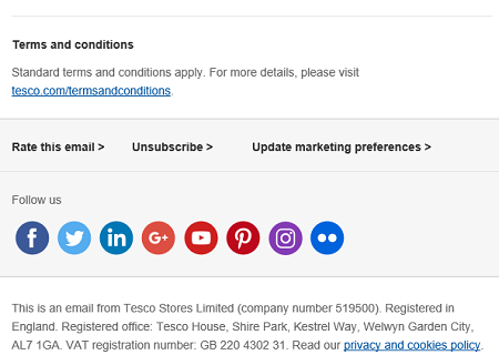
Just like Norwegian Airlines, the unsubscribe link is clear and easy to spot. Use of a good sized bold font and whitespace.
Norwegian only beat Tesco because of the top unsubscribe link.
RateSetter
RateSetter really thought about making their unsubscribe customer centric. Using bold email body sized large font. Yet surprisingly it proved problematic for test participants, 9% didn’t find the right link for unsubscribe.
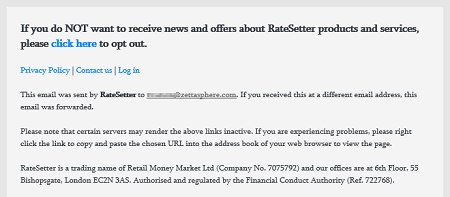
What is the problem with the large bold copy “If you do NOT want to receive …”?
Perhaps people are looking for the word unsubscribe rather than opt-out? Perhaps using link text click here rather than unsubscribe made it hard to spot? Perhaps the line of copy was just too complicated when scan reading?
The weak usability performance was so remarkable I re-ran the test with new participants to check the result. The second test verified the result.
Norwegian Airlines and Tesco don’t wrap their unsubscribe link in a line of copy and had great results. To conclude, the line of copy gets in the way.
One test participant read the email for 50 seconds before deciding the best place to unsubscribe was clicking the login button at the top!
A simple single word bold unsubscribe is more effective. Consumers understand it.
After all, when it comes to all-important buy conversion links, you wouldn’t use; “If you DO want to save in our flash sale in the next two hours then click here to take advantage”.
PayPal
PayPal ranks lower for usability performance.
Firstly, the unsubscribe option is in a block of copy with low contrast and smaller font.
Secondly, the copy isn’t explicit about unsubscribe, but rather talks about marketing preferences.
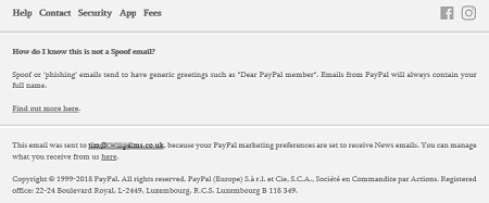
“You can manage what you receive from us here” is clear for email marketers. But consumers don’t have the experience of email marketers!
When asked how to stop getting emails, users found the PayPal copy too cryptic.
The most picked second choice, with 6% of participants, was the link ‘Find out more here’. The link to find out about phishing rather than unsubscribe.
Adding the word unsubscribe into the copy, or better, into the link text would make it more usable. Such as a link; “Manage preferences and Unsubscribe”.
eBay
eBay has an unintended decoy. It clearly confused participants.
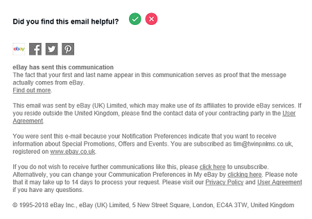
The well-meaning email feedback tick and red cross buttons are confused as the option to unsubscribe. 14% of test participants clicked the red cross assuming it was unsubscribe.
I can hear the groan from people who click the cross and are mystified why they continue to get eBay email. That’s trust damage and a likely spam complaint. Ouch.
The usability is compounded placing the unsubscribe link in a dense block of grey copy.
Contrast with Tesco that also have a rate this email option in the email footer, but without any user confusion.
eBuyer
As with eBay customers must work hard, reading a dense block of small grey font text to find the elusive unsubscribe link.
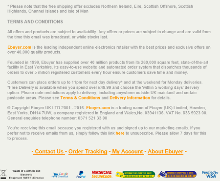
The most clicked link, after the unsubscribe, was ‘Contact Us’, with 8% of participants clicking.
The participants who clicked ‘Contact Us’ spent 28 seconds looking for a suitable unsubscribe option before deciding ‘Contact Us’ was the best choice.
Rescuing the Unsubscribe
Whilst best practice is to make it easy to find the unsubscribe link, the unsubscribe request should be confirmed on a landing page.
Rather than an instant unsubscribe the moment the unsubscribe link is clicked. Sometimes called one click unsubscribe.
I strongly recommend against one click unsubscribe links for three reasons:
- Customers may accidentally unsubscribe and not even realize
- Some spam filters click unsubscribe links
- A landing page gives the option to persuade the subscribe to stay subscribed with different options
One click unsubscribe is not required by email unsubscribe laws. There are no issues with laws including CAN-SPAM, GDPR or CASL. Whilst one click unsubscribe is not required, one unsubscribe rule that must be followed is not requiring a login to unsubscribe.
General Data Protection Regulation (GDPR) says removing consent should be as easy as giving it.
Unsubscribe page examples from Michaels, M Gemi and Bonobos illustrate different options. It’s possible to rescue 5% to 20% of subscribers this way.
Michaels – offer frequency down subscribe
This unsubscribe page from Michaels has an appealing design with friendly tone of voice, in keeping with the brand.
They offer the option of reducing frequency to persuade some people to change their mind. Though it doesn’t say by how much:
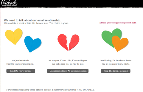
Michaels focus on frequency because in surveys consumers consistently say frequency is the number 1 reason they unsubscribe.
Bonobos – offer snooze and more options
Like with Michaels, the Bonobos unsubscribe page below has copy with a friendly voice, in keeping with the brand.

They provide multiple frequency options and a snooze option. A snooze option suspends all emails for a period. For Bonobos 30 days. This this can work well for customer and brand. Once the snooze is over normal email frequency resumes and the customer doesn’t miss anything.
Some brands that use the snooze concept on their unsubscribe page offer different periods of snooze or snooze for a set number of emails.
Snooze is an option to consider for occasional purchase items, when customers know they have no need for the brand for a while. Such as travel.
M Gemi – many options to rescue
The example from M Gemi of unsubscribe provides not only frequency options but also preference for gender and types of email; new products, trends and sales.
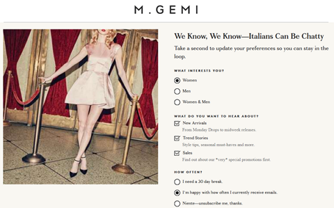
This arguably has too many options. The paradox of too much choice is well explored, people tend to pick nothing when too much evaluation is needed. Think hard about the most important options to offer. Check results and remove options that are not often picked.
Unsubscribe best practices
Based on the usability tests and brand examples, the best practices for unsubscribe footer links can be summed up in nine points:
- Make the unsubscribe prominent at the bottom of the email
- Use the word unsubscribe for the link text. Its what consumers look for
- Consider an unsubscribe at the top as well as the bottom. Particularly if deliverability is a concern.
- Don’t wrap the unsubscribe link in a long line of copy
- Avoid more dominant links in the footer that sound related to unsubscribe
- Use a large font for unsubscribe link. Minimum size as the email body
- Put plenty of whitespace around the unsubscribe link to help it standout
- Use an unsubscribe page to confirm unsubscribe rather than one click unsubscribe
- Provide alternative options on the unsubscribe page to keep people subscribed, but don’t overload, ideally 2 or 3 options only